This is my first attempt to describe in detail how I go about doing things. I am a kinetic learner (I learn by trying things). I am fairly good at describing my process, although this took me a lot longer than I thought.
I ran into several problems with new techniques that I wanted to try, and discovered some new techniques along the way.
I apologize for being long winded in places :)
...and yes, there are probably easier ways to accomplish some of things I've done..I'll find them eventually.
My muse commented that she really liked me last piece as it anticipatory, stating that she preferred pieces without "coarse kinetics". I really like that term and I've stolen.
She described a scene, piecemeal but it was enough for me to pick up on.
I mulled over how to compose it, and went to DAZ3D.com to look for scenery.
I found these:
http://www.daz3d.com/i/shop/itemdetails/?item=13662
http://www.daz3d.com/i/shop/itemdetails/?item=12183
I am a Platinum Club member, so at $2 each they were dirt cheap.
This scene is done up in Poser 9. I also use the following DAZ products:
Victoria 4.2 and Boudoir Whispers.
The first thing I noticed when I loaded up "The Morgue" was the examination light. The package doesn't come with any lights, but I'd read that in Poser 9 you could create a light source within the scene, so I wanted to try that.
After much playing around with reflection settings in the material room and what not, I ended up with 2 spot lights. One narrowly focused and parented to the light emitting surface of the main light object. This would make it look like it was lit if it was visible in a scene (which it is not in this one...at least not at the time I write this). The other is the light emitting from the main light itself. This is a spot light parented to the main light, but pointing away from it.
I found the main light movement parameters a bit restrictive. If you're going to use this, try and set your scene up so the light base attached to the ceiling isn't visible. This way if you have to raid it, you can go to the body node and increase the Y axis without losing the base.
Here is a shot of my final lighting set up for the Main Light:
It may be difficult to see but the lights are there. The light you see pointing towards the light prop is there so that if the lit surface appears in the scene, it will be bright as if lit.
The light that is illuminating the target is slaved to the light prop itself. This is the shadowcam view of that light:
So, all that's done. Now I want to think about the mood I want to convey in the final image. What questions do I want the viewer to ask?
One of the reasons I picked the morgue was because I wanted the viewer to wonder what was going to happen next. Is this Faith's final scene?
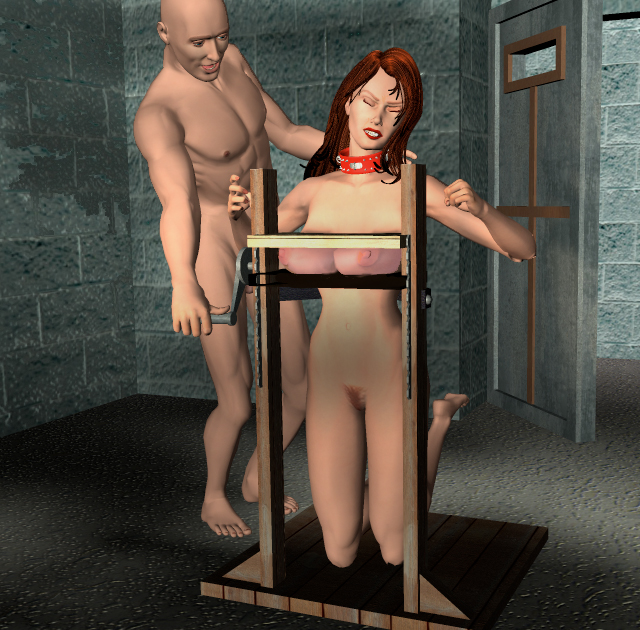
I start off the next stage by posing Faith. Remember the opening paragraph here. The words from my muse "Anticipatory". So, with that in mind I came up with this initial working pose:
You can see its rough. That's fine for now, right now she's just posed for blocking and lighting. I did have some issues with getting her into this position. I like to set my poses with "Limits On" as it forces me to use proper body mechanics to pose my models...but face it, V4 is not a gymnast, so sometimes you have to play with min/max parameters. In this case I had to double the negative bend limit for each thigh.
To do this, click the icon beside the parameter select
Settings and change the parameter that needs changing. Here's a screen shot:
The next step is put Faith in the final pose....
You can see that there there is quite a bit to do yet. But to get to this point I had to do a fair amount of playing with the spot light and different scene lights to get to this point.
You'll also note that the teddy is now black and if you're familiar with Boudouir Whispers you'll know there are no black MAT's. No problem here as black will blot out every colour. All I had to do was go into the material room and change the
Diffuse Color of the teddy material.
You will also note that as I progressed that I changed the transparency as I thought it would make things look better. This is also done in the material room by changing the transparency parameter for the material.
You'll see down the line that this caused a lot of problems with the original technique I planned to use in post work but I'll talk about that later.
Okay, so now I'm looking at the scene, I think that it needs something else (you can actually see some of it quite clearly in the preview image of the material room),
I notice the fridge unit of the morgue set and decide to set out on a macabre course. I decide to use one of the lockers and put a draped body in it. I just used P4 Woman for this with some standard P7 hair. I went with the P7 hair as I wanted it to look fairly realistic as I didn't know how visible it would be in the final render.
In the past with previous versions of Poser on slower computers if I wanted to run the collision tool I usually had to let the system run overnight, or throughout the workday and hope that it would be done when I came back to it. I wanted to try it out on Poser 9 so here was the perfect opportunity.
No screenshots here, sorry, but it's fairly simple. I loaded a hi-rez square from the primatives folder in the Props library. I scaled it and positioned it over the P4 woman who was lying on the extended tray of the Fridge figure. The square is called "cloth_pane" in the scene.
This took a bit of time and a few attempts but with the help of documentation and google I eventually figured it out. The one thing I noticed was that draping was FAST...good thing too because I ran the draping tool about 20 times.
All the work is done in the Cloth Room. The first step is to Clothify the cloth pane. The next is to position the cloth pane. I found that close to the back of the figure (or bottom as she's lying down) worked best.
I then grouped the corners in the grouping tool and added them as a Constrained group. This prevents the draping tool from moving them (this is really important!). You want the constrained group to be on the tray.
I don't do much animating so I have my Poser preferences set to a single frame. When I ran the draping tool the first few times I ended up with some pretty strange results...or none at all. With some reading I finally realized that you have to give Poser some frames to work with. I set it to drape over 10 frames and it worked beautifully (and the final result was translated to Frame 1 so I didn't have to bother with adjusting frames either).
For a texture for the cloth pane Ijust made up a jpg in Photoshop with some black, grey and maroon spots and splashes and added it to the cloth pane in the Material room. You do this by adding a 2D image node off of diffuse and adding the jpg (I didn't bother with specular as its not very prominent).
The last thing I did was set a spot light as a "fridge light". I played with different intensities and settings...I decided I liked the red best as the colour lent a sinister air, and didn't detract from the focal point of the image.
I played with the texture of the morgue slab as well. I altered it's reflective qualities and took a copy of the texture file and added some blood. I googled morgue slabs and I actually found what I believe is the inspiration for the West Park sets as when I looked at the pictures I immediately thought of the ward. Then when I saw the slab I thought, "Yep, this is what he was looking at"
http://www.derelictplaces.co.uk/main/showthread.php?t=4578
So finally, this is what I end up going into postwork:
My plan for postwork was to try out an idea I had to use layers to handle clothing. In the past whenever I had body part poking through clothing in the final render I'd fix it in postwork, but it occurred to me to render them separately. That is to turn everything else off in the scene (but not "cast shadows") and render over black. I always export anything I'm going to postwork as a TIF. When opening these up in Photoshop anything black or white will be transparent.
I should mention that I wanted to do this as I wanted to add lashmarks to Faith.
What I'm saying here is that my final render going into postwork had Faith naked. I then used the Advanced Figure Manager python script I bought at RuntimeDNA.com to hide everything but the teddy. I rendered that and exported.
When I first imported the base layer into PS I noticed that it looked odd. The whole scene was too bright. Remember when I mentioned that black is transparent? That was the problem. My default bg colour in PS is white. Easy fix. I added another layer, dragged it below the base layer and made it black...viola...problem fixed....but wait...why not take advantage of this and do some tweaks.
I added an adjustment layer and played with brightness and contrast settings to get just the right effect :) This way I didn't have to play with the select,burn or dodge tools to get an overall effect without affecting the foreground.
When I tried to use it, I realized that making it transparent meant that I could see parts of the teddy that Faith's body would be hiding...so it was useless!
I went back to Poser and did a render of the scene as shown above (I had an idea). I imported the new render into the current PS image as a layer. I went back to the original layer
So, now I had a nude layer, and a clothed layer. The clothed layer was visible as it was on top. I went to the nude layer and using the lasso select tool I outlined where I wanted the lash marks to go. I then selected the clothed layer and cut the selected areas. This took pieces out the teddy from the clothed layer showing the nude layer beneath. The image I wanted to convey was that the whip ripped the teddy.
After much playing I realized that I did not have the skill to make the teddy look ripped. I tried using various brushes with the eraser tool, the cloning tool, etc. The biggest problem I felt was that I could not make it look like the teddy was on top of the flesh and not part of it (not sufficiently anyway). I couldn't use blending tools as that would effect the entire layer and I couldn't find a regional "drop shadow" tool.
I was perplexed and actually walked away from this for a few days. Finally I went back into Poser 9. I tried changing Faith's skin to something I could import into PS as transparent, but even on the lowest render settings some shading and texture was added. But here's one attempt that I thought was a bit humorous:
This is the best I could come up with...(you can't see Faith at all (except under the teddy) in the TIF.
I knew what I had to do but was dreading it. I had to make the front of the teddy completely transparent. Of course I wasn't lucky enough to have the teddy mats already set up like that, so I had to use the material grouping tool in the Material Room.
To start, I once again hid everything in the scene except for the teddy. I changed the background to a bright pink as I needed high contrast. I set the camera to "Posing Camera" as that was easiest (and you don't want to move your main scene camera when you're doing renders for layers!)
I went into each material of the teddy and carefully highlighted the front of each and Assigned Material using "new[part]front". After setting the transparency to 1 for all these new groups I did a render and got this..
Not perfect, but I could fix it in PS. I imported this as a new layer into my image and used the erase and cloning tools to fix it.
When I was happy with what I had, I used the magic select tool, and inversed the selection. I went to the clothed layer with that selection in place and cut out the part of the teddy that was going to be replaced by the new layer.
I ended up with this:
Okay...wow...ummm, its kinda bright!
I made extensive use of layer adjustments (colour balance, brightness/contrast, hue and saturation) to fix this.
I made several attempts at lash marks...this was the best I could come up with..
I used a combination of the erase and smudge tools using different brushes and brush types (as well as strength settings) to "rip the teddy".
For the lashmark I used my usual technique of copying from the flesh layer and using the hue and saturation tools to turn it red before adding highlights wand tweaks with the paint brush and smudge tool.
I wasn't happy with the results and was playing around with stuff when I stumbled across the "Warp Selection Tool". Remember, I am an amateur at this stuff, I learn almost everything by "stumbling across it".
After some playing I decided to "rip the teddy" completely open.
What you do after you select the part you want to manipulate is whack CTRL-T then pick the "Warp" button at the top. You want to custom warp by dragging the different points around.
I thought the results looked pretty cool and while it's not completely realistic I thought it passable.
Instead of using lash marks, I went with broader lash marks (as if poor Faith had been flogged). Again I accomplished these by copying flesh and playing with hue and saturation.
I tried a new technique with this render to get some realistic bruising. I set some blending options on the top bruising layer (very light inner and drop shadows). I wanted to give the marks some depth.
To improve their colour I created two more layers below the bruising layer. Purple Bruises and Yellow Bruises. Purple and yellow are the colours of old bruises. On the bruising layer I used the magic tool to highlight everything except the existing bruises (in other words, the transparent parts), I then reversed selection to capture the content of that layer.
I highlighted the two layers in turn and using a very large paint brush with a splatter pattern I dropped in the appropriate colour on each. I didn't paint, I just positioned the brush and clicked the mouse. I made extensive use of the blur tool as well.
I then hid the yellow layer and adjusted the opacity of the purple layer. This came out to 8%. For the yellow layer I ended up with 11%. The top bruise layer's opacity is 46%.
The final result looks pretty good I think.
The final step were tears (as my muse appreciates those). I used my standard, highlight the place I wanted tears. Copy that area from the face, paste into a new layer.
I then used the brightness and contrast tools until I had a gray area that satisfied me. I used the plastic wrap filter and with the layer blending tools I embossed the layer. I set opacity to 87% as I didn't want them too prominent.
Now that that was done I turned to fixing the stockings. I did this with the cloning tool for the thigh. After playing around with the foot I realized I wasn't going to beable to encase the foot all the way with the stocking. After looking at some pictures online, I took my burn tool and darkened the edges to make it look like it was a rip.
I sometimes use camera angles, or add props to hide stuff like this.
The last step is to add the text.
Its not "professional quality" but consider this is something I do as a hobby and am self-taught (and found some new techniques in this render), I think the final result is pretty good:
I'm working on a new render (this time with full knowledge of the warping tool). Faith has once again gotten herself into a predicament!